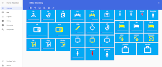
After getting most of the hardware in place I started to focus on the user interface since my main purpose with the hass.io setup was to get control and automation of my light sources. For me that meant a panel with all available light sources, regardless of technology (z-wave, 433 MHz, zigbee, bluetooth) or vendor. Apart from switching light sources on and off there was obviously a need to be able to dim the lights on each button.
My end goal with using panels is to set up a separate touch sensitive screen in my house as dashboard and control station.
This is how I did it.
After extensive searching on the Internet and asking in forums I realized that there was no out of the box solution for what I wanted to achieve. I wanted full customization of button, icon, color and slider. I installed multiple custom components only to be disappointed at its short comings. Fortunately there is (almost) always a solution but it might take a long time to find it.
One of my favorite custom components (and buttons) is the button-card. It is very flexible in terms of customization, properly maintained and updated over time. Therefor I chose to base my buttons on the button-card. Unfortunately though it did not support a dimmer control slider and neither did the developer want to add it.
During my quest to find a solution the button-card was updated with the ability to include any other card as part of itself and that is the solution I finally settled with. Combined with slider-entity-row (and card-tools) I got exactly what I was looking for.
The complete code for one button in my ui-lovelace.yaml.
The code above gave me a single button with all the functionality I wanted but it is also important to be able to group multiple buttons in a good way. If buttons are just added after each other in the ui-lovelace.yaml they will group themselves in a three column block that does not make good use of available space. I wanted the buttons to cover the whole user interface panel and I also wanted it to look good on a mobile device.
The solution: another custom component, layout-card. With layout-card it is possible to configure the layout of all cards into different blocks and control the order in which they are displayed.
Use of layout-card in ui-lovelace.yaml to get a proper button panel.
Note: To get the user interface as described above I had to use the hass.io user interface Lovelace in yaml mode which is enabled by the following code in configuration.yaml.
Recommended: While doing changes to configuration.yaml, always do Configuration Validation.
Recommended: When editing code a proper text editor helps alot.
Please let me know in the comments field if you have any questions or comments.
My end goal with using panels is to set up a separate touch sensitive screen in my house as dashboard and control station.
 |
| Figure 1. Light source panel that looks good both on a computer and mobile device.. |
After extensive searching on the Internet and asking in forums I realized that there was no out of the box solution for what I wanted to achieve. I wanted full customization of button, icon, color and slider. I installed multiple custom components only to be disappointed at its short comings. Fortunately there is (almost) always a solution but it might take a long time to find it.
One of my favorite custom components (and buttons) is the button-card. It is very flexible in terms of customization, properly maintained and updated over time. Therefor I chose to base my buttons on the button-card. Unfortunately though it did not support a dimmer control slider and neither did the developer want to add it.
During my quest to find a solution the button-card was updated with the ability to include any other card as part of itself and that is the solution I finally settled with. Combined with slider-entity-row (and card-tools) I got exactly what I was looking for.
 |
| Figure 2. Button-card and slider-entity-row |
The complete code for one button in my ui-lovelace.yaml.
- type: custom:button-card
  styles:
    card:
      - background-color: rgb(3, 169, 244)
      - box-shadow: none;
      - overflow: unset
    name:
      - color: white
    label:
      - color: yellow
    grid:
      - grid-template-areas: '"n" "i" "l" "slider"'
      - grid-template-columns: 1fr
      - grid-template-rows: min-content fr min-content min-content
  size: 40%
  state:
  - value: "off"
    styles:
      icon:
        - color: white
  - value: "on"
    styles:
      icon:
        - color: yellow
  - value: "unavailable"
    styles:
      icon:
        - color: red
  custom_fields:
    slider:
      card:
        full_row: true
        hide_state: true
        type: custom:slider-entity-row
        entity: light.entre_tak
      overflow: unset
      filter: opacity(80%)
      color: rgb(3, 169, 244)
  entity: light.entre_tak
  name: tak
  icon: mdi:hanger
The code above gave me a single button with all the functionality I wanted but it is also important to be able to group multiple buttons in a good way. If buttons are just added after each other in the ui-lovelace.yaml they will group themselves in a three column block that does not make good use of available space. I wanted the buttons to cover the whole user interface panel and I also wanted it to look good on a mobile device.
The solution: another custom component, layout-card. With layout-card it is possible to configure the layout of all cards into different blocks and control the order in which they are displayed.
Use of layout-card in ui-lovelace.yaml to get a proper button panel.
panel: true
cards:
- type: custom:layout-card

  layout: vertical
  cards:

  - type: horizontal-stack
    cards:

    - type: custom:button-card
      template: template_switch_slider
      custom_fields:
        slider:
          card:
            full_row: true
            hide_state: true
            type: custom:slider-entity-row
            entity: light.entre_tak
      entity: light.entre_tak
      name: tak
      icon: mdi:hanger

    - type: custom:button-card
      template: template_switch_slider
      custom_fields:
        slider:
          card:
            full_row: true
            hide_state: true
            type: custom:slider-entity-row
            entity: light.badrum1_tak
      entity: light.badrum1_tak
      name: tak
      icon: mdi:toilet

    - type: custom:button-card
      template: template_switch_slider
      custom_fields:
        slider:
          card:
            full_row: true
            hide_state: true
            type: custom:slider-entity-row
            entity: light.tvattstuga_tak
      entity: light.tvattstuga_tak
      name: tak
      icon: mdi:washing-machine
 |
| Figure 3. Light source panel with on, off and dimmer functionality using layout-card. |
lovelace:
  mode: yaml
frontend:
  themes:
    dark_blue:
      primary-color: rgb(65, 105, 225)
- id: '1570825239787'
  alias: Set theme at startup
  trigger:
  - platform: homeassistant
    event: start
  action:
    service: frontend.set_theme
    data:
      name: dark_blue
Recommended: While doing changes to configuration.yaml, always do Configuration Validation.
Recommended: When editing code a proper text editor helps alot.
Please let me know in the comments field if you have any questions or comments.
Heya!
ReplyDeleteI tried copying your code and everything works fine except that my slider is "invisible". It's there but it has the same color as the background. If i lower the brightness then I can a darker line i.e. the "slider line", but the slider "drag-button" is the same color as the background, or invisible, it's hard to tell.
Any pro tips?
I have the same problem myself, since I could not change the color of the slider I changed the theme color instead, that makes the slider "visible".
DeletePut this in your configuration.yaml, check configuration and reboot.
frontend:
themes:
dark_blue:
primary-color: rgb(65, 105, 225)
Oh, interesting. Is that a Lovelace restriction then?
DeleteThis comment has been removed by the author.
ReplyDeleteI'm trying to set this up so that I can have
ReplyDeleteMain Icon:
Tap: Toggle
Hold: navigate
That part is easy, and already done. However, I also want to be able to control the color of the bulbs by tapping or holding on/by the slider.
The closest I've gotten to something working so far, is enabling the name of the slider, and changing the font so that it doesn't spill off the card. I can then tap the left to change color or slider on the right for brightness.
Please let me know if you have a more elegant way to do this, it looks a bit tacky at the moment for me.
Sorry, I don’t. Customizing cards are a bit tricky. Quite some time has passed since I did this, HA has evolved, possibly there are much better ways to do this now.
ReplyDelete