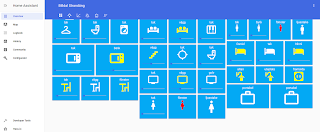
A good way to get a professional looking user interface is to add high quality icons. The best way to add icons to hass.io is to use the icon database from https://materialdesignicons.com.
The code for adding an icon to a custom component button card is simply.
The code for the button-card component including an icon.
The code in the button-card that includes the template.
Please let me know in the comments field if you have any questions or comments.
| Figure 1. Materialdesignicons.com is an excellent source for hass.io icons. |
icon: mdi:sofa
The code for the button-card component including an icon.
- type: custom:button-card
  template: template_switch_slider
  custom_fields:
    slider:
      card:
        full_row: true
        hide_state: true
        type: custom:slider-entity-row
        entity: light.lounge_tak
  entity: light.lounge_tak
  name: tak
  icon: mdi:sofa
The code in the button-card that includes the template.
template: template_switch_slider
button_card_templates:
  switch_slider:
    styles:
      card:
        - background-color: rgb(3, 169, 244)
        - box-shadow: none;
        - overflow: unset
      name:
        - color: white
      label:
        - color: yellow
      custom_fields:
        slider:
          - filter: opacity(80%)
          - overflow: unset
          - color: rgb(3, 169, 244)
      grid:
        - grid-template-areas: '"n" "i" "l" "slider"'
        - grid-template-columns: 1fr
        - grid-template-rows: min-content fr min-content min-content
    size: 40%
    state:
    - value: "off"
      styles:
        icon:
          - color: white
    - value: "on"
      styles:
        icon:
          - color: yellow
    - value: "unavailable"
      styles:
        icon:
          - color: red

  template_switch_slider:
    template: switch_slider
 |
| Figure 3. Light control panel in lovelace by using custom component button-cards. |
Please let me know in the comments field if you have any questions or comments.
This comment has been removed by the author.
ReplyDeletediatremir-na Andrea Demchuk https://www.vnuexhibitions.com.hk/profile/Ang-Ginto-Sa-Makiling-Pdf-11/profile
ReplyDeleteonzansofe